Friday, 21 January 2011

Josh's DigiPak Plan

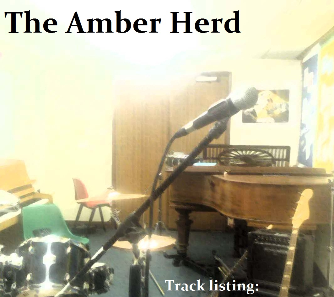
This creates a simple sense of how my digipak will end up:

The "Bench Shot" for the front cover

The photo album for the centre, with track lyrics

and on the back a shot of the instruments alone, suggesting that the Amber Herd have 'Stage Fright' - I plan to use the shot from the advert as this will create familiarity with the consumer when they look at the CD and their mind will remember the advert. This is a good use of consistency.




By Joshua Drake

Josh's DigiPak Centre and Disc idea

This is the centre to my DigiPak. I have used the images I created earlier and used an old style of paper for the background to give the feel of a photo album. This works well with the white borders I created and creates a professional and realistic centre to my DigiPak.


This is also the idea for my digipak disc. It is quite simple as I think that too much emphasis on the disc can make it look tacky


By Joshua Drake

Josh's finished images for the inside of the digipak and front cover image

I have edited each image by first cutting the people out of the shots, and then using filters in Adobe PhotoShop to make the pictures more interesting and profesional. This will go into the centre picture which is a double page for the inside of the digipak. The images all alter the lighting and hue satuaration to make them look more profesional. The use of clothing was very important to choose as it will be the main focus of the image seeing there are no people in the images. The clothes as a casual teenage individual style, making it easy for the audience to identify with the characters and thus the situation. The top image will also be the front cover of the digipak as I believe it is the most profesional looking image and presents the theme of stagefright well. By Joshua Drake

Josh's Effects

I wanted the pictures to look kind of dated so here are the effects I have chosen that best suit that idea:


I think both are great effects but the lighting one looks more realistic. As though the flash has gone off.

By Joshua Drake

Josh's Cut up shots

These are the shots I will use in the DigiPak. I have cut the people out of them in but in some cases left hands in the shots for a variety. I will need to use filters in PhotoShop to edit these pictures.

I have framed some of these shots really well!


By Joshua Drake

Thursday, 13 January 2011

Josh's Magazine advert layout 2


I have slightly altered the magazine advert. All I have done is slightly altered some of the font to make it fit together a little better. I have also moved the text at the bottom of the advert down as I felt the large open space ended up pulling the focus away from the image. These are a few simple changes but have had a great effect on the final outcome of the advert. I think that with the focus on the image, the theme of stage fright is emphasised.


By Joshua Drake

Wednesday, 12 January 2011

DikiPak Cover-Josh


This gives an idea of the type of layout I will use in my DigiPak, I think the font is good as it is similar to the advert but it doesnt stand out enough so I may re edit my advert to match the font I end up using.

By Joshua Drake